Firework Clay Studios
print | brochure | layout designFirework Clay Studios
print | brochure | layout design
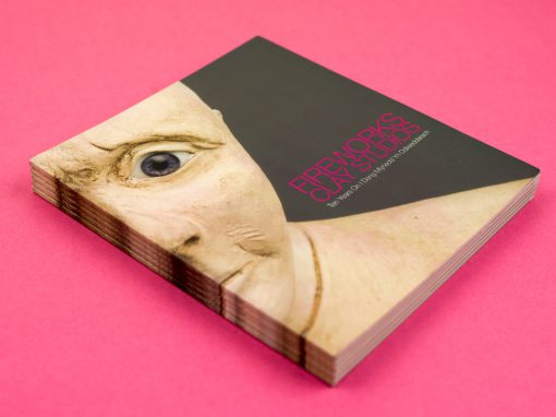
Hidden amongst an alleyway of garages in Riverside, Cardiff, you would never have noticed that behind an unassuming blue door lied a creative sanctuary that is Firework Clay Studios – A studio cooperative providing work space and specialised equipment for ceramic artists in a serene and inspiring environment.
Fireworks approached me back in 2007 to design a bilingual catalogue to mark their 10th anniversary as a cooperative, as well as showcase members’ work and promote the studio space itself. Working closely with Lowri Davies, one of the members, it was quickly established that they were looking for something clean and contemporary that would highlight the ceramics themselves and the calming creative atmosphere of the studios. Looking at the ceramic works, I liked the rough and readiness of the clay and decided to use the raw clays as a colour palette for the catalogue, to compliment the photography and give an overall contemporary feel. The shape of the catalogue also lended itself well to the style of photography and helped to set back the text-heavy essay that ran throughout the booklet.


“Gillian’s work was exemplary. She was punctual, co-operative and professional at all times. It was her level headed and accommodating approach to customer relation that left the most significant impression on all who worked with her on the project. Her involvement stretched beyond the call of duty. Her guidance and own integrity was evident throughout, producing an outstanding publication that was far more stylish and professional due to her professionalism. I would have absolutely no hesitation in working with her again in the future.”
Dan AllenMore Projects

Always happy to talk.
Call or email today and who knows where the conversation might take us…
